Thursday, 17 March 2016

Our Main Film


This is our main film production and our genre is horror


https://www.youtube.com/watch?v=W_TvEThp9DM&feature=youtu.be

This link is to our main film, and the quality is better

Wednesday, 16 March 2016

Q7. Looking back on your preliminary task, what do you feel you have learnt in the progression from it to the full product?

What have you learnt about continuity?
By creating the continuity I have realised how hard it is to create a good film. Having to use the correct camera angles and movements can be very difficult. I found that you have to have a nice transition when going from one face to another, otherwise it won't flow very nicely, and will look jump and as though you didn't edit it very well. I found using the 180 degree rule was no problem at all because we simply and quickly decided where we were going to place the line. I found that the match on action was very simple to complete and once we'd decided what we were going to base our continuity on then filming this part was very simple.

What mistakes did you make and how did you avoid making them for the main task?
When we first began filming our continuity we thought we just had to make a mini horror film but after several attempts at filming we realised that we'd been doing it wrong, but finally we did finish and I think I looked quite good. Mistakes we made included quite jumpy transitions, and so we took this into consideration for the main film, and we most definitely improved as you can see at the start with the nature shots. We think that our use of angles in our continuity didn't need any improving due to the fact we used quite a few, however for the main task we didn't use very many different shots, but this was probably due to the fact we were using the hand held camera method, and by using a tripod means you have a steadier and better looking scene.

Continuity

OVER THE SHOULDER

This is an over the shoulder shot, and we used this type of shot twice in order to represent the conversation going on between the two characters. We learnt that this was a better and more professional looking way to film two characters having a conversation that just seeing them both at the side.


HIGH-ANGLE-SHOT & LOW-ANGLE-SHOT

 With this shot, we were trying to identify who had more authority and you can see that the interrogator has more because we used a low angle shot on them, in contrast to the suspect who has a high angle shot


MATCH ON ACTION

Here, our match on action consisted of a shot of the character opening the door and then the camera filming her on the other side walking into the room. Personally I think this was a nice way to open the film because it straight away shows our skills of being able to film from different angles.


TWO SHOT


This shot could represent how at this point in the interrogation the two of them are equal and that nobody is more superior. Although this isn't what we wanted to present, the reason why we used this shot is because we wanted different angles in the continuity.

CLOSE UP


This shot was used to show the facial expression of the character, and express her emotions.

Main Film

PANNING


In this shot we used panning to show display nature and to create the nice flow effect with the other nature shots when it came to editing


CLOSE UP

In this shot, the facial expression was used to create tension and to display the amount of dismay that this character was in.

TWO PERSON SHOT

This shot could portray the amount of authority that the characters have between them, but because they're not in a large group then I'm not sure if they do hold a lot of power.


HAND HELD CAMERA


We used the hand held camera method to make it look like a perspective of what the characters were seeing.


LOW ANGLE SHOT


The shot here can suggest some sort of superiority that the trees have over the group, as they're taller than them and are towering over them

Thursday, 10 March 2016

Q6. What have you learnt about technologies from the process of constructing this product?

Tripod
Because our main film was inspired to film using the hand held camera method, in order to make it look similar to a mockumentary, we didn't film a lot using tripods. However the beginning of the opening did include a fair amount of steady filming, to represent nature and to symbolise it's calm and steady influence, this creates quite an ironic atmosphere, since the very beginning can be seen as being symbolic of positive and calming nature, in comparison to the end which represented nature as being quite dangerous as someone goes missing.

In other shots the use of the tripod was beneficial towards us as it allowed us to display how well we could handle a camera on a tripod, and also to illustrate how we could use the specific panning movement using the handle on the tripod, which I personally found quite difficult to accomplish as it was difficult to keep the camera looking steady. Although, we didn't use any of the footage where we panned, because we found it wasn't relevant when adding in into our film. In addition, I think it was a good idea to use some shots on the tripod, because I personally feel that if you constantly use the hand held camera effect, it can get quite confusing and difficult to understand which character is filming.


Camcorder
This is the cam corder we used for our continuity and our main film. It was quite a good camcorder in terms of graphics and the sound. They were also very easy to carry round and didn't cause us any trouble with filming.
For our continuity task we only used two cameras and there was no trouble with using them, I was quite pleased we only used two because we were able to get some good angles and shots.


 We did attempt to represent what ever was following the group, and this could be seen through the way the camera was hidden through leaves and undergrowth during the beginning of the opening, and the fact that the camera was quite small meant we were able to do this.


For our main film we used three cameras and again we had no trouble using them, and our idea to use a hand held camera method, influenced by the 'Blair Witch Project', I think worked really well. By using these cameras without a tripod allowed us to explore camera angles and movements that were available to use.

The only problem that we had with the cam corder was having to delete specific clips because it was quite an unnecessarily long process, in addition, due to method of deleting clips it was a constant worry that you accidently deleted other groups work.


 The camera we used was a Canon EOS 1200D, which we used to capture photos of our location, setting, evidence of filming etc. during filming in the main film.

We didn't have any problems with this camera and the quality of the pictures were very good. It was extremely easy to use, however to improve, we could have used alternative lenses to increase the quality of the pictures.


IMovie


IMovie was the program we used to edit our film and it was available to us to use on apple mac computers. It was very useful and easy to understand, with a variety of different effects to choose from when editing.

On the other hand, we did have quite a few problems when we first started editing because we didn't understand how to use it, but we didn't have any major problems with this program.

The kinds of effects that we used and were able to use included:
  • different backgrounds
  • music
  • sound effects
  • text options
  • transitions- fade outs, white to black etc.
YouTube
YouTube is what I used to research different openings to films, and the films that inspired, 'The Blair witch project' and 'The ring'.
Before I was inspired by the 'Blair witch project'  and 'The ring', YouTube was really helpful because it enabled me to understand the possibilities of an opening film i.e. 'Se7en' was an alternate way in which to begin a film because it didn't include and characters or key plots, I just though it was quite simple but effective.
The only problems I've had with YouTube is the fact that it will play the clips I've added on my blog on some computers, but on others the clips won't play.

Google
Google was what I used to research a variety of facts concerning films that inspired us and images that were relevant to films that inspired.
I haven't had any problems with Google and I've been able to gather reliable information about other films from it.

Blogger
Blogger, in my opinion, is quite a difficult blogging site to understand, since there are quite a lot of design settings and different ways to present your blog, and when you come to create a blog sometimes when you place paragraphs and pictures in places they move around when you go to preview the blog.
On the other hand, I do like the fact you can change the design of your blog so that you can make it fit with the theme of your blog and my theme/genre was horror.


Tuesday, 8 March 2016

Q5. How did you attract/address your audience?

Our audience consists of people ages +15 who regularly and enjoy watching a horror films. The ways in which we attracted this audience was through the use of music/sound, mise-en-scene, editing, the USP of our film, cinematography and horror conventions.

MUSIC/SOUND

In our film, we included a range of different sound techniques, diegetic, non diegetic, sound motifs, sound effects, synchronous sounds and contrapuntal sounds, and a lot of these sound techniques is how we attracted our audience, due to how there is quite a lot of scary and spooky.

Diegetic sounds
Sounds that are symbolic of nature i.e. birds, stream and wind are sounds that were natural to our film. I'm quite pleased that we were able to capture diegetic sounds, although with some of symbolic nature sounds they were non-diegetic i.e. the thunder which you wouldn't realise due to the events taking place in this scene and the lighting which was low key.

Non-diegetic
We used the song 'Ten green bottles' in the very beginning of our film but we changed the song to  'One green bottle' so it was symbolic of how at the end of the film there will only be one character left, and we added this music over the nature shots. I think by adding them over the scenes of nature was a symbolic contrast of how nature can be portrayed as something that expresses life in contrast to the song which is symbolic of something that will eventually take life away.


Some of the bird sounds were non-diegetic, in order to create the illusion that they were real and recorded and placed in the film.


At the end of our film we included the sounds of twigs snapping, and the sounds were recorded by covering the lens of the camera whilst making the noise of crackling twigs then we it came to editing our film we detached the audio and added it over the scene when the group are looking for the missing girl.
We also used the same method with the screaming and the heavy breathing. The screaming took a few attempts to make sound realistic. We wanted to make it sound real to create a unnerving mood, which would scare the audience.


Sound Motifs
The recurring sound throughout moving images to represent an idea in our film was the 'One green bottle' song due to how it was used to represent the idea that there is going to be one character left and all of the others have gone missing.

Sound effects
The sound effects we used, consisted of an effect called the 'cathedral', which was available to us on IMovie. The 'cathedral' sound effect echo's the audio but also makes it sound quite spooky and chilling especially seeing as we used this effect on the 'One green bottle' song just to create that unnerving suspense.We used this song at the start of our film and just before the end. This song was recorded by one of our group members, and when we came to editing we detached the audio from the recording and placed this over the film.

Synchronous sounds
The main use of synchronous sounds that can be recognised were our footsteps and also the water sound at the beginning. I think it was a good idea that we used these sounds as it gives it that sense of realism.

Contrapuntal sounds
The only type of sound effect that is non-diegetic and contrasts with the mood of the scene is the first few scenes of nature and the 'One green bottle' song, which is because, as I've said, normally you associate nature with something positive as it is something portrayed as giving life, and if you contrast this with the song, which is symbolic of taking life away as each of the characters go missing, which makes the audience feel quite anxious and creates a tense atmosphere.

MISE-EN-SCENE
I have picked parts of mise-en-scene which I would have said scared me i.e. the lighting and colour, body language and facial expressions,

Lighting and colour
In horror films you'd assume the lighting would be low key because usually because the story lines of these genres create tension and aren't very calming. By using low key light instead of high, makes the audience aware that the film isn't going to be positive but quite negative and unhappy. In our horror film we used a lot of low key light environments and an example of this is in the screen grab below. This screen grab is a prime example of how you know something unexpected and bad is going to happen, baring in mind during this scene one of the character dies. The weather conditions on this day were still dull and dreary, however we did change the colours to make it darker.
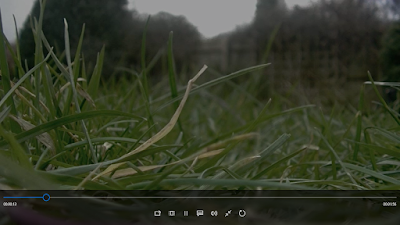

Another example of colour and lighting is in the screen grab below, and this shot is just before the screaming starts. I think the use of colour and lighting in this shot is brilliant because of how there is so much symbolism portrayed. The idea that the ideas are black can symbolise intimidation and mystery and the idea that these trees are towering over the group can suggest that they don't have a lot of power and that the forest is controlling them. Perhaps it's controlling their emotions and anxious feelings because of the darkened conditions.


Body language and facial expressions
The use of body language and facial expressions in horror films are key, for example, in the 'Blair witch project' the facial expression of the girl, which can be seen below, suggests she is anxious due to the bulged eyes representing how she is quite on edge and alert, the tear is an obvious presentation of how she is very upset and in perhaps a terrified state, finally the fact that her eye brows are raised shows signs of innocence suggesting she's feeling quite vulnerable and defenceless.
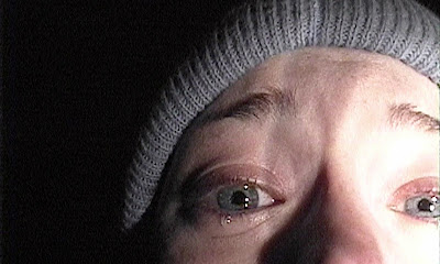
                       
The Blair witch project

Facial expressions in our film can be presented through the screen grab below, as it shows the tension in her face and it can also portray her feelings. She is evidently terrified of something and linking it with the context of our film this shot is just after they've heard the scream, suggesting she's becoming nervous and uneasy.

Setting and props
I think that the setting would very much attract our specific audience due to how a typical horror can be seen as being set in a scary location i.e. a haunted house, woods etc.
This is because it can be quite a difficult place in which to escape, as portrayed through the 'Blaire witch project' and how they get lost. It can also be quite a secretive and intimidating location due to how the trees are towering over you symbolic of how little power you have.


However, some of our film is set on the beaten track which doesn't portray any kind of scary themes of create any tense atmospheres as the group aren't lost, or anything bad isn't happening to them.

I wouldn't describe the props we used scary at all, and certainly not anything that would scare our audience. Although the only prop that I think did create some sort of tension was the torch, because during this scene they're trying to look for their friend, and this light could be symbolic of their hope and perhaps the darkness around them is presented as the anxiety that they are feeling which is larger and consuming them.


EDITING (pace/effects)
Certain parts of our editing I think made the film more tense and scary, these can be shown through the titles of our film, the nature scenes at the start and the colouring at the start of the film.

The way that the camera jumps forward every so often in the tunnel creates that unnatural and spooky effect, especially seeing as there's more darkness which adds more of a tension to the scenes. We also changed the colour at the end of the tunnel take make it darker so that it presents the idea that even if they reach the end of the tunnel, where the light is, something bad is still going to happen


We edited together parts of nature scenes to create a contrast between the happy and more positive beginning in comparison to how nature can be expressed as something negative towards the end.


We didn't use any effects on the nature scenes however we did make sure that the pace was nice and clean. This can be seen through the way we made the camera pan to the left in one of the tree shots and then the next tree shot we carried on the pan to the left and we also did this with the tyre shot however on the shot with the stream we made the tyre swing to the right and then we panned the camera to the right going the same was as the stream.


Finally, the very first scene was edited by changing the lighting slightly to presented the idea that something bad was going to happen, because if the lighting was high key then the unexpected event wouldn't be as effective.

USP- of our film
 Because of how our film was inspired by the 'Blair witch project' and this was about students filming going missing, we thought that we could propose our film by making missing posters, but we'd add the date of the film and when it was going to be released.

I think this sort of film proposal is a unique and individual way of trying to get people to see your film, especially if it includes actors/actresses that are famous, seeing something like this would intrigue people to look at the posters and probably want to see the film.

Another way to promote our film would be a trailer, and I think we would make it quite tense but without giving to much away so that our audience feel more interested in coming to see it. I would also include jump scares into the trailer just so that those who like horror films know that it's a traditional horror film that will most definitely scare you.


CINEMATOGRAPHY

The way we used the camera for our film was to present the perspective of the protagonists, for example when the group are walking to find a camp site there's a view of one of the characters pointing the camera on her feet whilst walking up the steps, this is meant to be a perspective of what the character is seeing.


Another way that we showed this perspective and making it more suitable for our target audience was by using it in an intensified situation for example, the end of our film when the group are trying to look for the girl. The camera suddenly turns around which is a representation of the head and of how the character is very aware and alert.


Finally, there's a shot of scene where the group have obviously been asleep due to how the camera suddenly turns on after a couple of seconds of darkness. The way the camera jolts is symbolic of when you wake up from a sudden noise you have to come too to realise what's happening.


The camera is also positioned at a strange angle as though the head was tilted from just getting up off the floor. 


HORROR CONVENTIONS

The types of character that we've included in our film which would make our target audience want to watch our film are:

The villain/antagonist- which is the thing that is making us going missing

The Protagonist/heroes- using these characters keeps the audience aware that there is still something scary about to happen because if there weren't any of these characters left then there wouldn't be any more jump scares or any

Tuesday, 1 March 2016

Q4. Who would be the audience for your media product?

Our target audience is 15-18 years who like watching horror films

Lily Oswald 

Age: 17

THEIR TASTES

Where do they like to shop? - Hoobycraft, Fatface, Costa, BS8, Forbidden Planet

What music do they listen to? - Marina and the diamonds, Florence and the machine, Mumford and sons

What films do they watch? - A nightmare before Christmas, Star trek into darkness, The heat

What TV programs do they watch? - Doctor who, Sherlock, Being human

Which one of these films makes her suitable for our target audience?
I think that 'A nightmare before Christmas' would probably be the film that's most close to a horror film because of how it's quite strange and spooky. It's also a gothic type animation which includes disfigured characters which could be quite disturbing mixed with the music of Danny Elfman who's music is quite unique and fits Tim Burtons films very well.


Julia Tyler

Age: 17

THEIR TASTES
Where do they like to shop? - Marks and Spencer's, Cath Kidston, Fatface, Waitrose, Forbidden Planet 
What music do they listen to? - The Beatles, Vampire weekend, Fleet foxes

What films do they watch? - Apollo 13, Skyfall, Dance of the vampires

What TV programs do they watch?- Doctor Who, Friday night dinner, Sherlock


Which one of these films makes her suitable for our target audience?
I think that 'Dance of the vampires' would be the film that's closest to a horror film even though it's a gothic horror comedy which you wouldn't really expect to be a horror about. Baring in mind there are vampires included in this film suggests it a horror film because this could be the antagonist.


Daniel Grant

Age: 17

THEIR TASTES

Where do they like to shop? - Morrisons, John Lewis, Aldi, Sports direct, Fatface

What music do they listen to? - ELO, U2, Coldplay, Crosby stills and nash

What films do they watch? - War of the worlds, way out west, toystory 3

What TV programmes do they watch?- Match of the day, sky sports, the detectorists

Which one of these films makes her suitable for our target audience?
The film that I think describes our target audience through this person is 'War of the worlds', due to how it is quite a distressing film which involves aliens coming to earth to take over.


Audience Feedback:
We showed six people, who met the target audience, our film so that we could gain information about ways to improve, about what was good, about camera angles/ movement etc.


QUESTIONS WE ASKED OUR AUDIENCE

What did you think was good about the film?
"Contrast of us laughing and the scream -the location of the woods -the titles in the tunnel -use of colour."

Is there anything we could do to improve our film opening?
"The ending was sudden and abrupt/ maybe fade it out/ make a shadow appear."

What did your think about the use of camera angles and movement?
"Group are walking, and Megan disappears and the camera turns round suddenly, the camera is like the eyes of the characters (hand-held)."

What did you think of our editing?
"I liked it when they are all having a good time and then they wake up as if the camera woke up."

What did you think of our performance?
The performance was natural it didn't seem put on or fake."